Overview
This case study explores the redesign of a university accommodation discovery experience, focused on helping prospective students browse properties more efficiently and make decisions with confidence.
The original experience overloaded users with information, created confusion around calls to action and made browsing feel heavy — particularly on mobile. Through user research, content prioritisation and interface simplification, the redesign transformed the listings into a clearer, more scannable and decision-focused experience.
The Challenge
The accommodation listing page had become difficult to use due to the volume of information displayed for each property.
Users were faced with:
- Excessive scrolling
- Repetitive information across listings
- Unclear calls to action
- Heavy visual density
- Difficulties comparing accommodation quickly
- A cluttered map experience
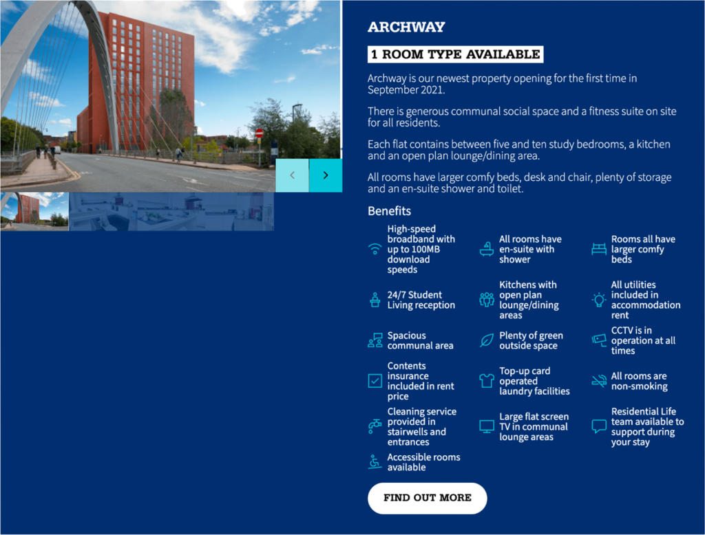
Testing with users revealed that many visitors misunderstood the purpose of the primary CTA, believing the button was intended to enquire about the accommodation rather than seeing it as a route to more information.
The structure of the listing cards contributed to this confusion, with every benefit and detail being surfaced upfront, the listings felt more like full property profiles than summary cards designed for exploration.
There were also business and legal considerations to solve for:
- Partner accommodation needed to be clearly labelled
- Pricing visibility needed improving
- The interface needed to remain accessible
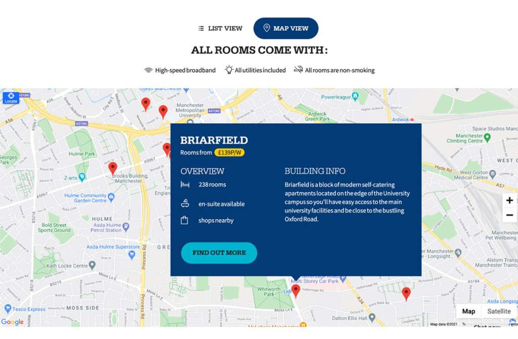
- The map view required refinement to avoid obstructing the map itself
Research & Discovery
To better understand how students evaluated accommodation options, both a survey and user testing were conducted.
The research identified several key decision-making factors:
- Room availability
- En-suite options
- Nearby amenities
- Distance from campus
- Weekly pricing
Interestingly, users did not value the long lists of standardised benefits that dominated the original design. Many of these benefits were expected as baseline features and repeating them across every listing added noise rather than clarity.
Additional findings highlighted that:
- Long labels reduced readability
- Dense layouts weakened visual hierarchy
- Mobile browsing suffered significantly from vertical page length
- Dark navy-heavy layouts felt visually oppressive
- The existing aqua/navy colour pairing raised accessibility concerns at AAA contrast levels
The Existing Experience
The original design relied heavily on:
- Large image galleries
- Extensive feature lists
- Dense text blocks
- Repeated amenities
- Oversized cards
This resulted in a browsing experience where users struggled to quickly compare accommodation options or understand what differentiated one property from another.
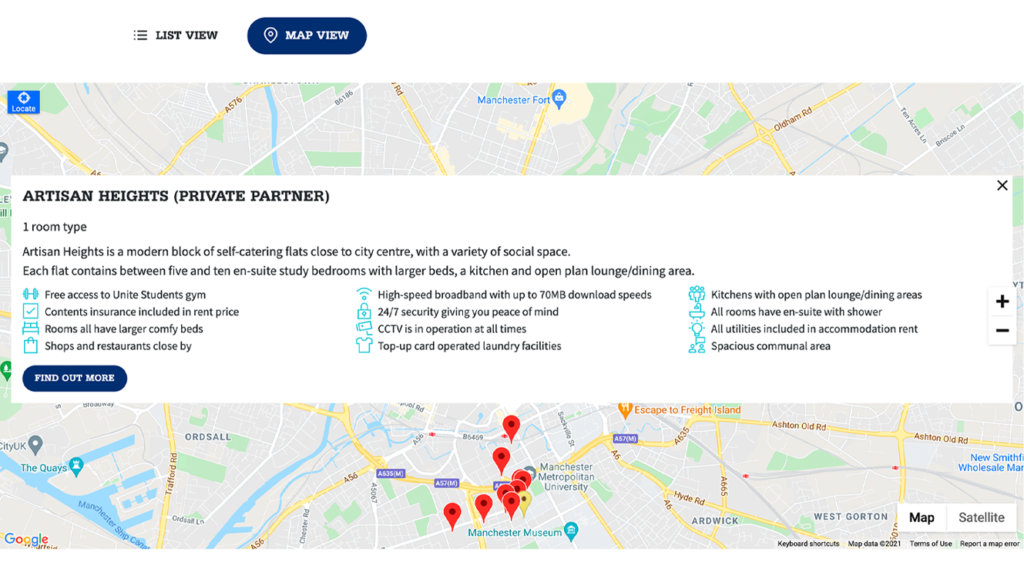
The map view compounded this issue further, with oversized popups obscuring large portions of the map itself.
Design Principles
The redesign focused on a few core principles:
- Prioritise decision making information and only surface the information users actually use to make decisions quickly.
- Reduce cognitive load by removing repetitive or low-value content that distracted from key details.
- Improve scannability and allow users to compare multiple properties rapidly without excessive scrolling.
- Strengthen visual hierarchy ensuring pricing, availability and key differentiators were immediately visible.
- Optimise for mobile and reduce vertical space usage and improve readability on smaller screens.
The Solution
The redesigned experience dramatically simplified the accommodation listings.
Key changes included:
- Removing thumbnail galleries from listing cards
- Reducing repetitive benefit lists
- Surfacing only high-value information
- Increasing emphasis on price-per-week
- Highlighting room availability clearly
- Introducing concise overview sections
- Clearly labelling partner accommodation
- Simplifying map popups
- Improving contrast between map overlays and the background map
Instead of treating each listing like a full profile page, the redesign repositioned the cards as gateways into deeper exploration.
Iteration & Exploration
Early concepts explored multiple layout directions for both list and map views.
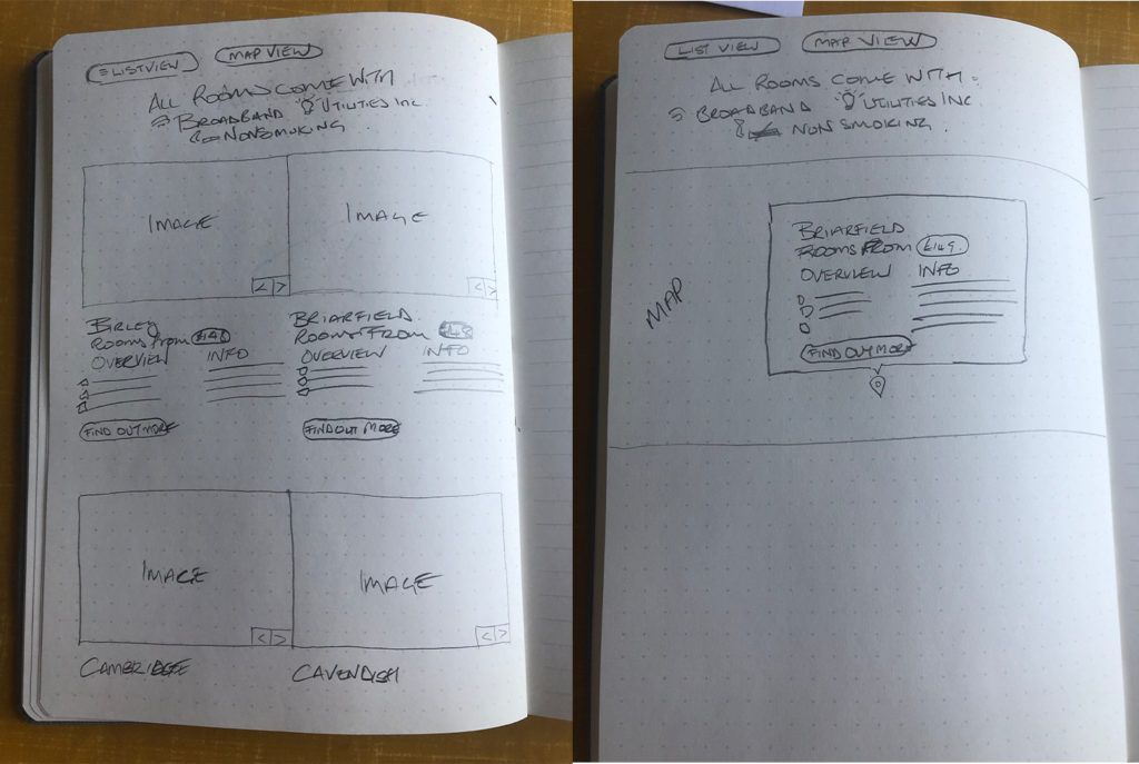
Low-fidelity sketches focused on:
- Compact content structures
- Reducing unnecessary imagery
- Improving spacing
- Simplifying interaction models
- Testing hierarchy before visual refinement
These early explorations helped validate the idea that less content would actually improve usability and increase engagement with deeper property pages.
Final Outcome
The final design created a significantly lighter and more focused browsing experience.
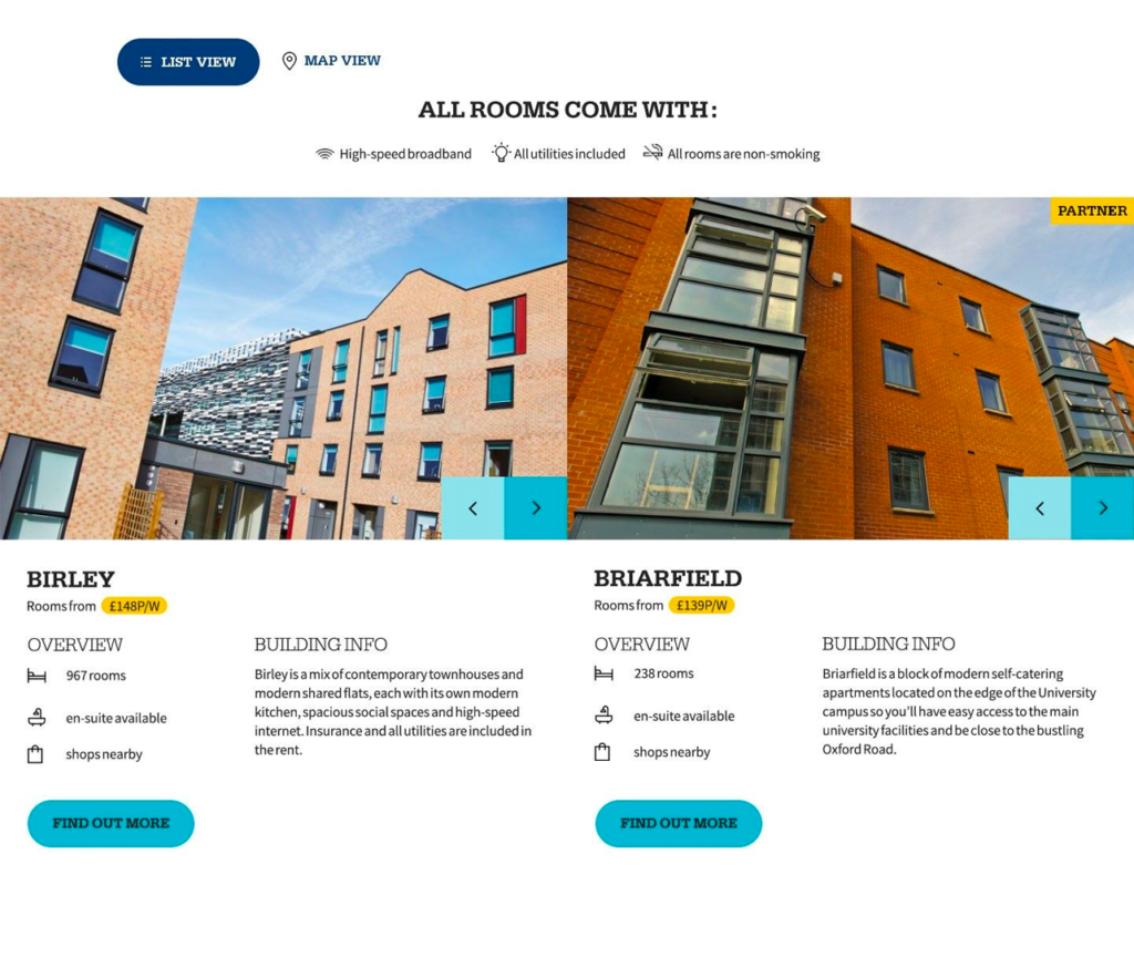
Improvements included:
- Faster Comparison, users could scan and compare accommodation options much more efficiently.
- Reduced scroll depth by having a compact card structure which dramatically shortened the listing pages.
- Clearer calls to action meant users better understood that the primary action led to further information rather than immediate booking.
- Improved accessibility
Contrast and layout refinements created a more accessible interface.
Better Mobile Experience
The reduced density and simplified structure translated far better to smaller devices.
Cleaner Map Experience
Smaller, more focused popups allowed the map itself to remain usable and visible.
My Role
I led the UX and interface redesign process, including:
- User research analysis
- Content prioritisation
- Wireframing and concept development
- Interaction design
- Accessibility considerations
- Iterative layout exploration
- Map view optimisation
The project required balancing user needs, accessibility considerations and business/legal requirements while significantly simplifying the overall experience.
Reflection
This project reinforced an important UX principle:
More information does not always create better decisions.
By removing unnecessary content and focusing only on the information users truly cared about, the experience became faster, clearer and easier to navigate.
Sometimes the most valuable design work is not what gets added, but what gets removed.